Monday, March 26, 2012

MORE BERMUDA TRIANGLES

First of all, back to the curtain system and spiky shapes experiments.  I spent a weekend playing with the new Vasari.  Cool stuff, moving around freely in perspective view and all that.  I tried out different ways of getting the triangulation.  Version one started with an extrusion.


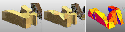
The dark brown lump is the sketchup model Iwas trying to match.  You can get to something roughly equivalent, but then you get stuck. Can't just choose to split a triangle anywhere you like.  The third image is a solar radiation study, one of the features built into Vasari.  So what about a loft ?

Series of polygonal profiles placed on reference planes.  Try to loft them all at once and you get these wierd curves.  Not the intention.  But if you start with two and then keep building the next one off the face of the last it's better.

You can go back later and adjust any of the polygons later using edit profile.  But you just end up with a different set of limitations.  The conceptual massing environment wants to keep all this enheritance going, so shapes know their entire evolutionary history.  This is great when you need it, but if you want to do free-form triangles, sketchup style.  Not the right tool for the job.  But you can make some interesting forms, and then put them into a wind tunnel.


Then I got this idea of placing points on the sketchup vertices and using these to build triangles.  Keep a couple of windows open with different visibility settings and it's quite easy.  Well not too hard.


At some point I found myself switching off the new perspective mode.  The geometry is confusing enough as it is.


I guess it took me a couple of hours to get all the way around.  But it's a pretty close match.  Sadly only surfaces, so no good for mass floors. 


Also the solar radiation tool doesn't seem very happy.  The results don't seem to make much sense.


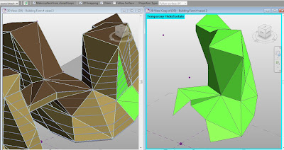
But you can built curtain systems off the faces, and have lots of fun with the wind tunnel.


Later on I put floors in manually, applied curtain systems and got carried away with the ecotect tools.  Had to go into Revit for the curtain system and there was a warning on bringing it back into vasari, but
it carried on working. 


That's the farthest I've ever gone with Vasari and a great learning experience as usual, but still haven't conquered the workflow for getting this kind of shape into Revit as a solid, fully functional massing family. I had another go with the step-by-step lofting technique and made some progress. 


I was actually building a pink solid using the green surfaces as a guide.  Careful use of subcategories to control materials and visibility in different windows. It's not right, but I was getting much closer this time.


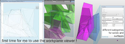
Luke over at "What Revit Wants" posted lots of interesting links to ways of moving between mesh & solid, rhino & revit, etc.  Maybe there's something in there to help.  But coincidentally I found myself in autocad today and realised that I am totally out of touch with the solid modelling capabilities this now has.


I only spent about 20 minutes on this and the form is totally random, but it's immediately obvious that this is a suitable tool for creating spiky triangular geometry that will come into revit as a solid and take mass floors etc etc.  I am a good seven years adrift from Autocad, and find myself grumbling and cursing whenever I have to use it.  No longer interested in doing the kind of drafting that consumed more than a decade of my life.  But maybe I could get excited about the solid modelling tools.   Who knows ?

10,9,8,7,6,5,4...

For most of the world that sequence continues as 3,2,1, zero.  For the Revit world (and users of other Autodesk products) the count-down is leading to 2013.  New products are about to be released.

I am excited, but also mindful of the fact that the last 3 releases have left me a little disappointed on first impression.  This is odd because the previous 3 had caught my imagination immediatedly as giant leaps forward.  Even stranger is the fact that these "disappointing" releases turned out to be major advances when viewed in retrospect.  

Perhaps the lesson is that the BIM journey is leap of faith into a future that we are all helping to shape in real time.  It is easier to see what is happening in hindsight than to confidently predict where we are heading.

Revit 2010 ruffled a lot of feathers with the ribbon interface.  Complaints everywhere & much publicised hacks for keeping the old-style screen layout.  But it's been a great success, even though there are still little bugs here and there (red ticks that go into hiding) ... much easier to learn for new users, more consistent with other autodesk products.  The other big feature in 2010 was conceptual massing.  Huge excitement, followed by confusion as I struggled to understand a deceptively simple and very different way of generating forms.  Took me a year or so to really get under the skin of the conceptual massing environment, but once I did ... enormous potential. 

At GAJ we didn't roll out 2010.  I think we were not alone in this.  We jumped straight to 2011.  The ribbon had settled down, and there were several new features we wanted to use.  The disappointment I think came from the fact that there seemed to be lots of little improvements, but no "big new features".  We had come to expect things like "Mental Ray Rendering" and "Conceptual Massing Environment" ... huge leaps forward.  But in retrospect, the modeless properties box & quick access toolbar have made a huge impact on my life, saving a few seconds hundreds of times every day.  Realistic view, ambient occlusion, temporary dimensions that remember their reference ... lots of little things that make a difference.

Once again, we haven't rolled out 2012.  This times the reasons are more internal, but it's now getting late and we will probably jump straight to 2013.  I have been using 2012 whenever I can.  I suspect that parts and assemblies will come to be seen as important first steps in opening up the model to 3rd party involvement.  We do need better ways of integrating the contribution of specialist suppliers and subcontractors into the BIM workflow.  Time will tell.  One of the best things for me is so tiny & so simple .  I'm talking about the transparency that comes when you select an object.  If that object is a floor or a wall the effect is dramatic.  I would never have guessed how useful this would be until I started using it.  Now I feel seriously frustrated when I am working in 2011.  What are you going to do ?  Keep putting the sunglasses on and taking them off again ?  Painfully clumsy once you have experience the ghost effect. 

This may well be my first "all text" post.  Just found my self reflecting on the past as I anticipate the excitement of a new set of toys.  I think it's important to stand back at regular intervals and try to see the bigger picture.  Actually my preferred expression is "see the wood from the trees".  Time to go and chop a few down.

Sunday, March 25, 2012

FAMILY FAVOURITES

Every once in a while I spend a whole evening trawling the web for new Revit families and dropping them into temporary folders.  These eventually get organised into a series of "collections" which are just revit projects with a containing families of the same category all neatly arranged in rows and often with explanatory notes & guidelines on sheets. 


A copy of these collections resides on our server for all Revit users at GAJ to access when they are looking for something.  Most of the collections also contain a good number of families made in house for various projects over the past 6 or 7 years.


Last weekend I decided to do some housekeeping and was shocked to find that stuff has been hanging around waiting to be "collected" for several months now.  The revisions log also indicates that some of my collections have not been updated for almost 12 months.  So I had a serious go at half a dozen out of maybe 20 files in total. 


One of the files contains "fill patterns" and incidentally I came across a couple of new ones.  I made my own 45 degree earth pattern a couple of years ago, but the NZ ones are a bit different so I added these.  The glass hatches are useful for mirrors.  Don't know why I didn't acquire one of these before.

The main focus was on sanitary fittings, what Revit calls plumbing fixtures.  I had downloaded 2 large collections (Kohler & American Standard) and it was very interesting to study these in more detail.  There was also a set from New Zealand via the excellent "Product Spec" web site.  Scroll down my sidebar on the right to find links to these and other content websites.


Let's start with New Zealand.  This is a set of fittings that lend themselves to being modelled in native Revit tools : extrusions, sweeps & revolves, maybe the occasional blend.  Generally quite well done, but oddly no reference plane set to zero origin, so some of the families default to a state where the bottle trap touches the floor. 


There multiple taps with separate visibility controls, which as an interesting approach.  I generally use a parameter to control "type of tap" which allows more flexibility when we are contracted to do interior design, and the clients keep changing their minds.  I extracted all the accessories as separate families for later use/adaptation.


Moving on to Kohler, there is an enormous collection available from their website, and I was extremely grateful for the single click zip file option that allowed me to download the absolutely everything relatively painlessly.  It's fascinating to inspect families like this and speculate who made them.  Sometimes you can see different signatures involved in a large collection & sometimes a more rigorous set of standards have been set. 


In this case, someone has really got carried away with the challenge of modelling smooth curves in native Revit format.  Some quite inventive solid/void combinations on show.  Oddly the basic geometry was often created using the generic model template and never converted to a plumbing fixture (easily done using the family category & parameters button)  Also no use of subcategories or material parameters, despite the fact that there is a material in the family called "vitreous china". 
The image below shows what happens when I set this as the default material for generic models (in object styles) and change it's colour to pink.  The second image shows one family converted to the plumbing category which has been given a different material setting.  The other 2 are still generic models (even though nested in plumbing fixtures)


So I can set a material via object styles, but this will apply to the whole object.  If I want a chrome button and a plastic seat, I need to use subcategories and/or materials parameters.  This only matters if you want to render, but then, why would I model in all this detail if I don't intend to render ?


Delving a little deeper, there is clear evidence of different modellers.  Some families make use of the coarse/medium/fine settings.  eg fittings that appear as simple boxes at coarse scale.  I quite liked the taps that reduce to model lines at coarse scale, but there is something very odd about the masking regions used in plan view.  Couldnt' work out what the intention was here. 


Also odd is the fact that there is no symbolic representation of the fittings.  Now there is some great modelling here, as I have mentioned, but it is impossible to create these shapes in revit without getting unwanted edges.  These are acceptable in 3d views, and don't show up in renderings, but they look awful in orthographic. 

The simple solution is to switch the geometry off in plan and replace with a 3d symbol.  You can use a CAD download, or draw it in Revit, depending on circumstances.  I like to do the same for front and side elevations.  At GAJ we often do 1:20 internal elevations of bathrooms so you want these to look as good as they would have in AutoCAD.

No disrespect to Kohler here, they have made a tremendous commitment by putting these families out and I salute them for it.  Hopefully they see this as the first step in an ongoing process and are open to constructive comments from active Revit users.


American Standard have also taken a big first stride along the BIM journey.  Their families are generally of two types, CAD imports & native Revit.  Once again there is an absence of 2d symbolic views.  I think that should be a priority item for both companies to address.  3d information is great, but we also need crisp, clean floor plans.


I was puzzled by the families with 3d CAD imports.  Normally these would come under the imports tab in object styles, where material assignments can be made.  I don't know how they managed to get layer zero to translate into a subcategory of plumbing fixtures.  If this was deliberate then it's very clever and I'd like to know the trick.  But I would also rename the subcategories to useful things like "porcelain", "chrome" & "acrylic".  This would allow native revit geometry & CAD imports to have their materials controlled from the same place, which would be wonderful.  Does anyone understand how to do this ?


The thing that makes me think it might be an accident is that the CAD imports have not been centred properly in plan view.  That and the absence of drafting symbols suggest to me that these families were not created by an experienced Revit user.  So thanks also to American Standard for a heroic effort to put these families out there and I hope they will look at upgrading them from time to time.

I will review more Revit families in due course, but I need to move on to the last section of this post.  I am developing a set of Generic Plumbing Families.  The intent is to produce lightweight, good-looking, flexible content that can be used from early design up to completion, or until replaced by more detailed manufacturer-specific content.  I am going to upload the first of these families, which is a 5 in 1 WC/bidet.


It's a simple shape that can be resized to match your design intent, and uses visibility controls to switch  between floor mounted and wall mounted, concealed cistern & close coupled, WC & bidet. 
There are masking regions and symbolic lines in all 3 orthographic views which also adapt to the same parameters.  I have a number of other families in development, which I will also be uploading. 


The intention is to produce a simple collection that deals with 75% of our needs in terms of sanitary ware, the rest being satisfied by high-quality manufacturer content (which would only really be needed where bathrooms are developed to interior design level)


I hope you will find these useful and perhaps they can also assist manufacturers in their ongoing efforts to produce useful BIM content on their websites.  The files are offered "as is".  I've tried my best, but I'm sure there are mistakes.  All comments and contributions are most welcome.  Content will surely get better if we all contribute with open hearts & minds.

DOWNLOAD HERE

Monday, March 12, 2012

CURTAIN CALL

I'm happy to announce that I was wrong about not being able to split a twisted quad face into two triangles.  Matt Jezyk, (a renowned reviteer from way back) responded amazingly quickly to point out how this can be done.  It's very simple, but quite subtle.


You use the add edge command, then you have to hover over a vertex (corner), click on it and then do the same at the diagonally opposite corner.  Works like a charm, so you can start with an irregular extrusion, add diagonals to all the vertical sides, then push-pull it into shape.  Follow up with curtain system by face and you're in business. 


This confirms my previous experience that the conceptual massing approach to creating forms is much more powerful and flexible than it seems to be at first.  You really have to stick with it because there are so many hidden treasures.  Reminds me a bit of when I first started playing electric guitar.  So much power there, but really frustrating because you don't know how to control it.  That comes with hours & weeks & years of experience.  Ultimately, there's no substitute for putting in the time.


I just began to scratch the surface of what you can do with these techniques while messing around this evening.  You can deconstruct the shape by deleting edges or faces.  The result seems to depend on what part of the original extrusion the geometry you delete is descended from.  Was it a side or a lid ? Sometimes it collapses down to a different set of triangles. But sometimes you get back to a twisted quad surface.


Much to learn.  But right now I need to head home, so see you soon.

Sunday, March 11, 2012

DRAWING THE CURTAIN

Truth be told, I don't get to use massing & curtain systems a great deal in my day job.  Both Revit and I have been bracketed as practical tools to be employed when projects are approaching the "nitty gritty stage".  I have accepted this as a fact of life, while remaining hopeful that the advantages of the BIM approach will gradually trickle down to those guys over in the corner playing with Sketchup all day.


So it's always a pleasant surprise to get a request for help at the earliest, exploratory stages of a design study.  The starting point was an abstract form that has been quickly knocked up in the aforementioned digital cardboard modelling tool.  It's easy enough to import this into a massing family, go to object styles and assign a material to layers.  I wanted something slightly transparent.  It only works if textures were applied "bylayer":  hence the yellow roofing here which failed to pick up the material from object styles.


Now you can bring this family into a project and use the "Curtain System by Face" command.   I wanted 2 types of curtain system.  Both of them have big mullions around the edge and no internal divisions.  One is glazed & the other is solid (for the roof).  This is easily set up using the type properties for Curtain Systems, Curtain Wall Mullions & Curtain Panels.


Once these were set up, I zipped around happily clicking on triangles and confirming with the "Create System" button from time to time. 


In no time at all you have a form which renders up very nicely, and you can play around with visual styles to your hearts content.


Here's one that I did with a few image processing trips, (smudge stick overlay, desaturate, blurring and masking to simulate depth of field)


All joking aside, Sketchup is a great little program for knocking up triangulated surfaces like this.  In fact that is all it does really.  Everything else is smoke and mirrors in the software to disguise the joins between triangles.  Very clever, but it's just faces.  As a result you can't use the mass to generate floor faces and calculate areas & volumes.  Perhaps you would be better off making the original form in AutoCAD 3D.  Not quite so user-friendly, but you might just be able to convert in into a solid. 


In my case I decided to build a real Revit form using the imported object as a guide.  It was fiddly, but it worked.  Start off by drawing a profile (closed loop of lines) in a top view.  Select this and "create form"  You get an extrusion. I changed the colour of the imported object to all yellow, and made the Revit form purple.  Now with the view set to ghost surfaces, I can see both shapes and how they overlap.


The rest is a matter of push-pulling points and orbiting around all the time as you work.  Slowly by slowly the Revit form can be adjusted to come quite close to the imported object.  The main difference is that the vertical sides will tend to be twisted quadrilaterals.


Back in the project I set up some levels, reloaded the mass family, created mass floor faces and then real floors (using floor by face) 


You can schedule these floors to add up their areas, but then you realise that this is not all USEABLE space. The ceiling height tapers down to nothing in several places.


My answer to this was to move the floors up to ceiling level and make them thick enough to fill up the useable space.  Just for fun I made three types of floor to represent different functional areas of the building.  So now you have a diagram that represents useable space as a solid and the floor/ceiling zone as a void. 


The areas have gone down because these are all now full-height, useable spaces.
This diagram sits quite nicely inside our triangulated skin, but sticks out just slightly in some places where the twisted surfaces of the Revit mass don't quite match the original triangles.


As far as I know, there is no easy way to split the twisted face of a Revit solid into 2 triangles.  You can easily add a triangular surface (which is what Sketchup does)  But that remains separate from the solid mass.  It can be used to make curtain systems by face, but not for making floors and calculating areas.  Within the conceptual massing environment there are tools called "add profile" & "add edge".  Wouldn't it be nice if there was an "add diagonal".  This would allow you to start with an extrusion and gradually deform it into an irregular shape where all the faces are flat and triangular.


Actually there is another approach which is interesting, but not very helpful.  You can divide the surface using a 1x1 pattern of flat triangles.  At first this seemed promising, but turned out to be disappointing for several reasons.  First of all the mass floors use the original twisted face and ignore the divided surface.  So your floors still stick out through the skin. Also, curtain system  by face selects the whole surface.


Secondly the triangles are actually two halves.  This shows up when you load a component with glass and framing.  It's easier to understand if you increase the number of sides to say 2x2 which will create 2 full triangles and 4 half triangles (if the surface you start with has 4 sides).  In the image abover you can see lots of rectangles floating in space.  These are the profiles I used to define the shape of the framing.  Revit cuts off the framing of partial panels but doesn't hide the profile because this is used in the one and a half sides of framing that remain.  So it shows up even if it is actually located in the part of the frame that has beeen cut off.  You can use a parameter to hide the profile, but you are still left with "missing edges" to the frames.


Thirdly you can't decide which diagonal to choose, which generally makes the difference between convex and concave and affects whether the floors will stick out of the skin or not.  And fourthly, the corners junctions of mullions are harder to resolve than with the curtain system by face tool.
So my preferred workflow for cladding this kind of Revit mass in giant triangular panels is to manually add triangular faces.  You only need to do this for faces that are not triangular in the original mass.


You can choose which diagonal to use, and make further subdivisions at will.  The corner points remain attached to the original mass so you can continue to manipulate this, reload into the project and update curtain systems.  It's a workaround, but it gives you a way to model these kinds of spiky angular forms directly in Revit.

Later on  you can add mullions and panels into your curtains system as shown in my final image.